Objectives
The objectives of this section are:
to explain the various visualization techniques
to understand in which situation a particular technique is used
to introduce higher dimensional visualization techniques that exist
Outcomes
By the time you have completed this section you will be able to:
choose a visualization technique based on the dataset attribute
create a scatter plot and histogram
Visualization Techniques are often specialized to the type of data being analyzed. Broadly visualization techniques can be divided into 3 categories:
- Visualization of small number of attributes
- Visualization of data with spatial/temporal attributes
- Visualization of data with many attributes
Visualizing Small Number of Attributes
The following visualization techniques are used for a data set which contains a small number of attributes. Some of these techniques are used for single attributes while others can compare the relationship between two attributes. Two common techniques are described below. Another one mentioned in the intermediate track is Stem and Leaf Plot.
Histograms
A histogram is a plot that displays the distribution of values for attributes by dividing the possible values into bins and showing the number of objects that fall into each bin. For categorical data, each value is a bin. These values can also be combined in some way if there are too many values. For continuous attributes, the range of values is divided into bins which are not necessarily of equal width. Each bin which contains some values is then counted.
In order to create a histogram there are three steps that are involved.
- Determine bin size
- Group data according to bin size
- Plot the histogram
Example
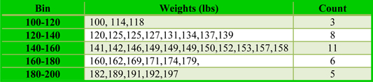
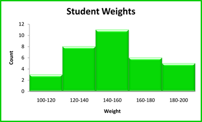
In order to track the progress of students in a physical education course an instructor weighed each student at the beginning of the semester. The data set below contains this information.
100,114,118,120,125,125,127,131,134,137,139,141,142,146,149,149,149,150,152,153,157,158,160,162,169,171,174,179,
182,189,191,192,197
Step 1: Choose the bin size:
The bin size for this example is 20
Step 2: Group data according to bin ranges
Step 3: Plot the histogram
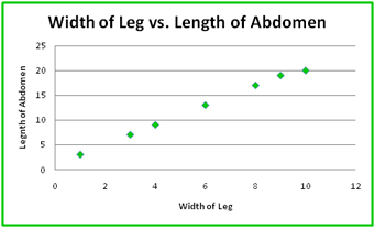
Scatter Plots
Scatter plots are basically used to demonstrate linear correlation. It is a type of display which uses the x and y coordinates to illustrate the value of two variables for a set of data. Data can be viewed as a collection of points, each having the value of variables which determine the position on horizontal as well as vertical axis i.e. x and y coordinates. Think of a scatter plot as a line plot the only major difference comes not in the creation but in the purpose. Scatter plots can be used for graphically displaying the relationship between two attributes & investigating the degree to which two attributes separate the class (when class labels are present).
Figure 3 below shows the relationship between two attributes for the spider dataset.