Objectives
The objectives of this section are:
To introduce you to various animations and visual representations related to input arff data and clustering results output
Outcomes
By the time you have completed this section you will be able to:
Analyze the input data with the help of the animations and visually differentate between clustering results based on how they are mapped on the graph.
Introduction
The clustering animations aim at helping the students understand graphically the clustering data and results.
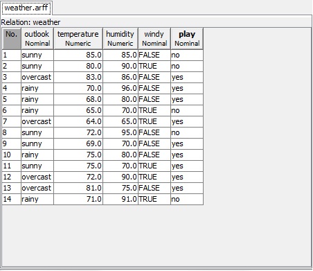
View Data
The View Data shows the content of the input arff file along with the relation name. The input file is in the arff format and has the relation details along with the column name and the data. The data is displayed in a table both attributes as column names and the respective data from under the @data tag in the arff file. Each record in the table has an index or id column. This is the id with which the record is associated when the clustered records are shown as a tree with Hierarchical clustering.
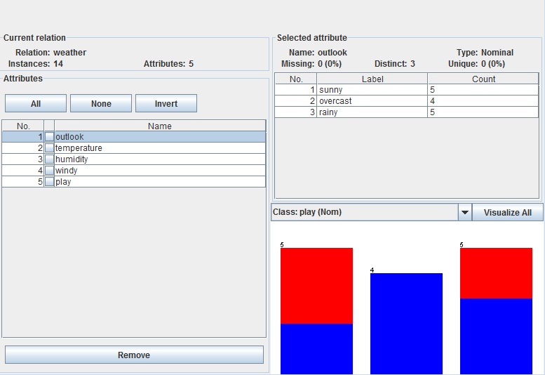
Visualization
The Visualization below shows the data from the arff file in the form of graphs with attributes selected on the left panel. The right panel shows the summary of the selected attribute like its type, its values and so on. The count is the number fo the records that have that value in the relation. the Lable are all the values that the selected attribute has. The Visualize all button shows the graphs for all the attributes (one for each) along with numbers on top of values meaning how many records have that value.
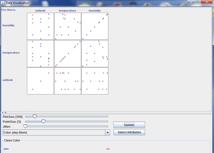
Display Patterns
The Display patterns animation displays the data across x and y axis where data of an attribute on one axis is against every other attribute on the other axis. The attributes on X and Y axis can selected from the two drop downs. The plot size is the size of the dot which displays the data. The size can be increased and once Update is clicked the changes take effect. The ‘Select Attributes’ allows the user to either reduce or increase the number of attributes against which you want to compare the data. The update shows the changes.
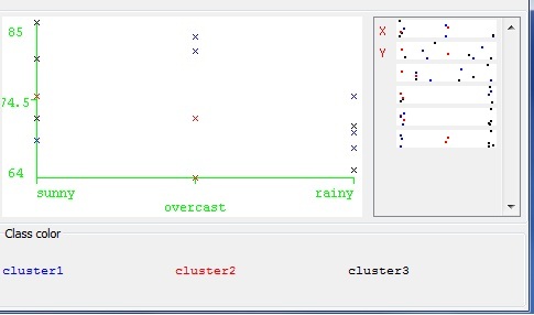
Clustering Results
The clustering results are displayed on a graph with the x and y axis as attributes. If a data point is clicked on, a small window pops up which shows the record details and the cluster that it belongs to. All the clusters are displayed in different colors and these colors can be changed by clicking on the cluster name.
Reference List
- http://www.cs.waikato.ac.nz/~ml/weka/arff.html : For arff file details and formatting.
- http://www.cs.waikato.ac.nz/ml/weka/index_downloading.html : Weka code download
- http://www.cs.waikato.ac.nz/ml/weka/ : Weka Tutorial and datasets
- http://code.google.com/p/classifiers/source/browse/clustering/src/org/pr/?r=16#pr%2Fclustering : Some UI Code.
- Introduction to Data Mining. By Tan, Steinbach and Kumar : For description and thorough understanding of Data Mining principles and algorithms.